Designing Flyers and Brochures That Convert Leads

Photo by ShockSnap
Designing Flyers and Brochures That Convert Leads
In a world dominated by digital ads and social media campaigns, flyers and brochures might seem old-school. Yet, when designed strategically, these offline marketing tools remain powerful lead-generation assets. A well-crafted flyer or brochure doesn’t just inform—it persuades, builds trust, and nudges potential customers toward action. The difference between a piece that gets tossed aside and one that converts lies in thoughtful design, clear messaging, and a deep understanding of your audience.
Let’s explore how to design flyers and brochures that don’t just look good, but actually convert leads.
1. Start With a Clear Goal
Before opening any design software, define the purpose of your flyer or brochure. Ask yourself:
- Are you promoting a product, service, or event?
- Do you want people to call, visit a website, or walk into your store?
- Is this for awareness, education, or immediate conversion?
A flyer promoting a limited-time offer will look very different from a brochure explaining a complex service. When your goal is clear, every design choice—from layout to wording—becomes more intentional and effective.
2. Know Your Target Audience
Designing without understanding your audience is like speaking without knowing the language. Consider:
- Age group and profession
- Pain points and needs
- Buying behavior and preferences
- Visual tastes (minimal, bold, corporate, playful)
For example, a brochure for a luxury real estate project should feel premium and refined, while a flyer for a fitness class may benefit from energetic colors and dynamic visuals. When your audience feels “this is for me,” conversions naturally follow.
3. Craft a Compelling Headline
Your headline is the first thing people read—and often the only thing if it doesn’t hook them. A strong headline should:
- Address a problem or desire
- Highlight a benefit, not just a feature
- Be clear, not clever to the point of confusion
Instead of “We Offer Digital Marketing Services,” try “Get More Leads Without Increasing Your Ad Spend.” This immediately communicates value and sparks interest.
4. Focus on Benefits, Not Just Features
One of the most common mistakes in flyer and brochure design is listing features without explaining why they matter. Your audience cares less about what you do and more about how it helps them.
For example:
- Feature: “24/7 Customer Support”
- Benefit: “Get instant help whenever your business needs it—day or night”
Use short paragraphs, bullet points, or icons to clearly show how your offering improves the customer’s life or business.
5. Use Visual Hierarchy to Guide Attention
Good design guides the reader’s eye naturally from one section to the next. This is known as visual hierarchy. To achieve it:
- Use larger fonts for headlines and key messages
- Highlight important information with color or contrast
- Break content into sections with whitespace
- Place the call-to-action where the eye naturally ends
Avoid clutter. Too much text or too many images can overwhelm readers and reduce comprehension. Clean, well-structured layouts improve readability and trust.
6. Choose Colors and Fonts Strategically
Colors and fonts are not just aesthetic choices—they influence emotion and perception.
Colors:
- Blue conveys trust and professionalism
- Red creates urgency and excitement
- Green suggests growth, health, or sustainability
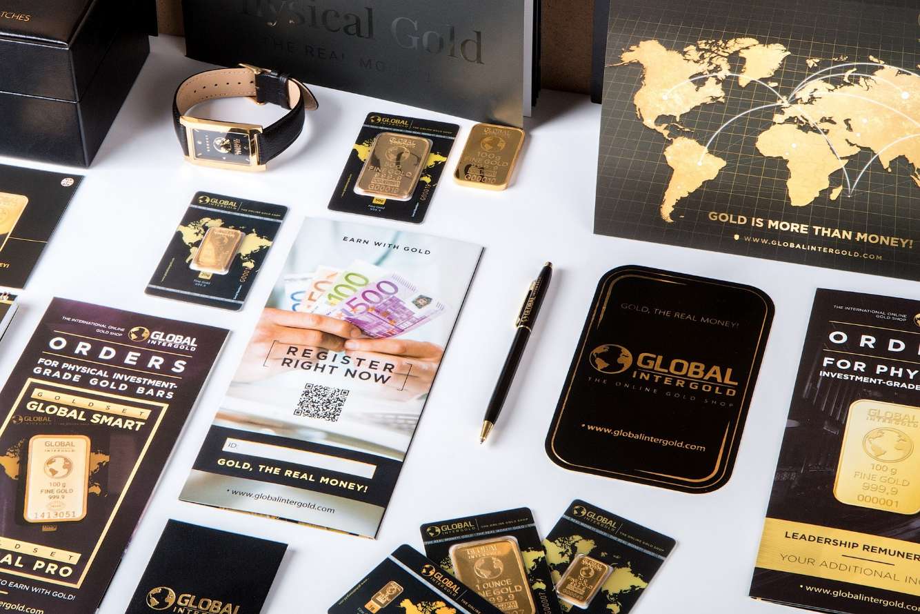
- Black and gold signal luxury and exclusivity
Fonts:
- Sans-serif fonts feel modern and clean
- Serif fonts feel traditional and reliable
- Script fonts should be used sparingly for emphasis
Limit yourself to two fonts and a consistent color palette to maintain a professional and cohesive look.
7. Use High-Quality Images and Graphics
Blurry photos or generic stock images can instantly reduce credibility. Invest in high-quality visuals that align with your brand and message. If possible:
- Use real product photos
- Include images of people using your service
- Use custom illustrations or icons for clarity
Visuals should support the message, not distract from it. Every image should have a purpose.
8. Build Trust With Social Proof
People are more likely to convert when they see that others already trust you. Flyers and brochures can include:
- Short testimonials
- Client logos
- Certifications or awards
- Statistics or results (e.g., “Trusted by 500+ businesses”)
Even a single authentic testimonial can significantly increase credibility and lead conversion.
9. Create a Strong, Clear Call-to-Action (CTA)
A flyer or brochure without a CTA is a missed opportunity. Tell your audience exactly what to do next:
- “Call Now for a Free Consultation”
- “Scan the QR Code to Get 20% Off”
- “Visit Our Website to Learn More”
Make your CTA:
- Action-oriented
- Easy to understand
- Visually distinct
If possible, reduce friction by offering something valuable, like a free trial, checklist, or consultation.
10. Optimize for Print and Distribution
Designing for print is different from designing for screens. Ensure:
- Proper margins and bleed
- High-resolution files (300 DPI)
- CMYK color mode for accurate printing
Also consider how and where your flyer or brochure will be distributed—events, mailboxes, in-store counters, or hand-to-hand. The format and size should suit the context.
11. Test, Measure, and Improve
Just like digital marketing, offline materials can be optimized. Use:
- Unique phone numbers or URLs
- QR codes with tracking
- Promo codes specific to the flyer or brochure
This helps you measure effectiveness and improve future designs based on real data.
Final Thoughts
Designing flyers and brochures that convert leads is a blend of strategy, creativity, and psychology. It’s not about stuffing information onto a page—it’s about telling a clear, compelling story that resonates with your audience and guides them toward action.
When you focus on clarity over clutter, benefits over features, and purpose over decoration, your flyers and brochures become more than marketing materials—they become silent salespeople working for your brand. In an increasingly noisy marketing landscape, a well-designed piece of print can still make a powerful, lasting impression.
